ToolbarAndroid是一个包装了仅限Android平台的工具栏(Toolbar)部件的React组件。一个Toolbar可以显示一个徽标,一个导航图标(譬如汉堡形状的菜单按钮),一个标题与副标题,以及一个功能列表。标题和副标题会在中间显示,徽标和导航图标会在左侧显示,而功能列表则在右侧显示。
如果工具栏只有一个子节点,它会在标题和功能列表之间显示。
尽管Toolbar支持在徽标、导航和功能图标上使用远程图片,这也只应该在开发(DEV)模式下使用。在发行(release)模式下,你永远都应该用图片资源来渲染这些图标。使用require('./some_icon.png')会自动帮你包装好,所以只要你不直接用{uri:'http://...'},就没什么问题。
例子:
render: function() {
  return (
    <ToolbarAndroid
      logo={require('./app_logo')}
      title="AwesomeApp"
      actions={[{title: 'Settings', icon: require('./icon_settings'), show: 'always'}]}
      onActionSelected={this.onActionSelected} />
  )
},
onActionSelected: function(position) {
  if (position === 0) { // index of 'Settings'
    showSettings();
  }
}
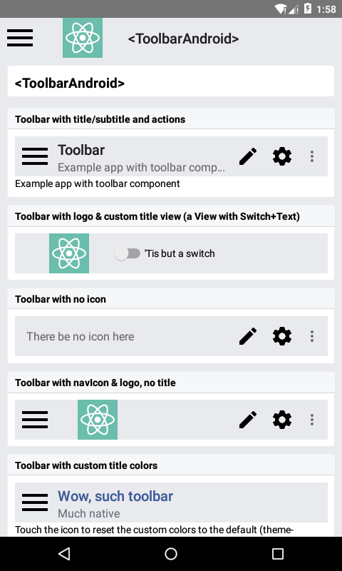
截图
属性
actions [{title: string, icon: optionalImageSource, show: enum('always', 'ifRoom', 'never'), showWithText: bool}] #
设置功能菜单中的可用功能。他们会显示为部件右侧的图标或文字。如果放不下,则会被放进一个弹出菜单里。
这个属性接受一个对象数组,每个对象可以有如下的字段:
title: 必须的, 功能的标题icon: 这个功能的图标,例如require('./some_icon')show: 是直接作为icon显示还是先隐藏,而在弹出菜单里显示:always总是显示,ifRoom如果放的下则显示,或者never从不显示。showWithText: 值为布尔类型,指定是否在图标旁边同时还显示文字
contentInsetEnd number #
设置Toolbar的右边缘和屏幕右边缘的距离。
除了导航按钮和菜单以外,设置这一属性也会影响Toolbar的内容区域。它定义了Toolbar与屏幕边沿的最小边距,可以用来使Toolbar的内容和一些设计上的网格线对齐。
contentInsetStart number #
设置Toolbar的左边缘和屏幕左边缘的距离。
作用同上。
logo optionalImageSource #
设置整个工具条的徽标。
navIcon optionalImageSource #
设置导航器的icon。
onActionSelected function #
当一个功能被选中的时候调用此回调。传递给此回调的唯一参数是该功能在actions数组中的位置。
onIconClicked function #
当图标被选中的时候调用此回调。
overflowIcon optionalImageSource #
设置功能列表的弹出菜单的图标。
rtl bool #
设置toolbar的排列顺序为从右到左。除了将这一属性设为true以外,你还需要在AndroidManifest.xml中添加:
android:supportsRtl="true"
以及在Main.Activity的onCreate方法中调用 setLayoutDirection(LayoutDirection.RTL)
subtitle string #
设置工具条的子标题
subtitleColor string #
设置工具条子标题的颜色。
testID string #
用来在端到端测试中定位这个视图。
title string #
设置工具栏的标题。
titleColor string #
设置工具栏的标题颜色。
例子
'use strict';

var React = require('react');
var ReactNative = require('react-native');
var {
  StyleSheet,
  Text,
  View,
} = ReactNative;
var RNTesterBlock = require('./RNTesterBlock');
var RNTesterPage = require('./RNTesterPage');

var SwitchAndroid = require('SwitchAndroid');
var ToolbarAndroid = require('ToolbarAndroid');

var ToolbarAndroidExample = React.createClass({
  statics: {
    title: '<ToolbarAndroid>',
    description: 'Examples of using the Android toolbar.'
  },
  getInitialState: function() {
    return {
      actionText: 'Example app with toolbar component',
      toolbarSwitch: false,
      colorProps: {
        titleColor: '#3b5998',
        subtitleColor: '#6a7180',
      },
    };
  },
  render: function() {
    return (
      <RNTesterPage title="<ToolbarAndroid>">
        <RNTesterBlock title="Toolbar with title/subtitle and actions">
          <ToolbarAndroid
            actions={toolbarActions}
            navIcon={require('image!ic_menu_black_24dp')}
            onActionSelected={this._onActionSelected}
            onIconClicked={() => this.setState({actionText: 'Icon clicked'})}
            style={styles.toolbar}
            subtitle={this.state.actionText}
            title="Toolbar" />
          <Text>{this.state.actionText}</Text>
        </RNTesterBlock>
        <RNTesterBlock title="Toolbar with logo & custom title view (a View with Switch+Text)">
          <ToolbarAndroid
            logo={require('image!launcher_icon')}
            style={styles.toolbar}>
            <View style={{height: 56, flexDirection: 'row', alignItems: 'center'}}>
              <SwitchAndroid
                value={this.state.toolbarSwitch}
                onValueChange={(value) => this.setState({'toolbarSwitch': value})} />
              <Text>{'\'Tis but a switch'}</Text>
            </View>
          </ToolbarAndroid>
        </RNTesterBlock>
        <RNTesterBlock title="Toolbar with no icon">
          <ToolbarAndroid
            actions={toolbarActions}
            style={styles.toolbar}
            subtitle="There be no icon here" />
        </RNTesterBlock>
        <RNTesterBlock title="Toolbar with navIcon & logo, no title">
          <ToolbarAndroid
            actions={toolbarActions}
            logo={require('image!launcher_icon')}
            navIcon={require('image!ic_menu_black_24dp')}
            style={styles.toolbar} />
        </RNTesterBlock>
        <RNTesterBlock title="Toolbar with custom title colors">
          <ToolbarAndroid
            navIcon={require('image!ic_menu_black_24dp')}
            onIconClicked={() => this.setState({colorProps: {}})}
            title="Wow, such toolbar"
            style={styles.toolbar}
            subtitle="Much native"
            {...this.state.colorProps} />
          <Text>
            Touch the icon to reset the custom colors to the default (theme-provided) ones.
          </Text>
        </RNTesterBlock>
        <RNTesterBlock title="Toolbar with remote logo & navIcon">
          <ToolbarAndroid
            actions={[{title: 'Bunny', icon: require('./bunny.png'), show: 'always'}]}
            logo={require('./hawk.png')}
            navIcon={require('./bunny.png')}
            title="Bunny and Hawk"
            style={styles.toolbar} />
        </RNTesterBlock>
        <RNTesterBlock title="Toolbar with custom overflowIcon">
          <ToolbarAndroid
            actions={toolbarActions}
            overflowIcon={require('./bunny.png')}
            style={styles.toolbar} />
        </RNTesterBlock>
      </RNTesterPage>
    );
  },
  _onActionSelected: function(position) {
    this.setState({
      actionText: 'Selected ' + toolbarActions[position].title,
    });
  },
});

var toolbarActions = [
  {title: 'Create', icon: require('image!ic_create_black_48dp'), show: 'always'},
  {title: 'Filter'},
  {title: 'Settings', icon: require('image!ic_settings_black_48dp'), show: 'always'},
];

var styles = StyleSheet.create({
  toolbar: {
    backgroundColor: '#e9eaed',
    height: 56,
  },
});

module.exports = ToolbarAndroidExample;