Modal组件可以用来覆盖包含React Native根视图的原生视图(如UIViewController,Activity)。
在嵌入React Native的混合应用中可以使用Modal。Modal可以使你应用中RN编写的那部分内容覆盖在原生视图上显示。
import React, { Component } from 'react';
import { Modal, Text, TouchableHighlight, View } from 'react-native';

class ModalExample extends Component {

  constructor(props) {
    super(props);
    this.state = {modalVisible: false};
  }

  setModalVisible(visible) {
    this.setState({modalVisible: visible});
  }

  render() {
    return (
      <View style={{marginTop: 22}}>
        <Modal
          animationType={"slide"}
          transparent={false}
          visible={this.state.modalVisible}
          onRequestClose={() => {alert("Modal has been closed.")}}
          >
         <View style={{marginTop: 22}}>
          <View>
            <Text>Hello World!</Text>

            <TouchableHighlight onPress={() => {
              this.setModalVisible(!this.state.modalVisible)
            }}>
              <Text>Hide Modal</Text>
            </TouchableHighlight>

          </View>
         </View>
        </Modal>

        <TouchableHighlight onPress={() => {
          this.setModalVisible(true)
        }}>
          <Text>Show Modal</Text>
        </TouchableHighlight>

      </View>
    );
  }
}
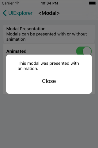
截图
属性
animated bool #
请使用animationType 属性代替。
animationType PropTypes.oneOf(['none', 'slide', 'fade']) #
The animationType prop controls how the modal animates.
slideslides in from the bottomfadefades into viewnoneappears without an animation
onRequestClose Platform.OS === 'android' ? PropTypes.func.isRequired : PropTypes.func #
The onRequestClose prop allows passing a function that will be called once the modal has been dismissed.
On the Android platform, this is a required function.
onShow function #
The onShow prop allows passing a function that will be called once the modal has been shown.
transparent bool #
The transparent prop determines whether your modal will fill the entire view. Setting this to true will render the modal over a transparent background.
visible bool #
The visible prop determines whether your modal is visible.
iosonOrientationChange PropTypes.func #
The onOrientationChange callback is called when the orientation changes while the modal is being displayed. The orientation provided is only 'portrait' or 'landscape'. This callback is also called on initial render, regardless of the current orientation.
iossupportedOrientations PropTypes.arrayOf(PropTypes.oneOf(['portrait', 'portrait-upside-down', 'landscape', 'landscape-left', 'landscape-right'])) #
The supportedOrientations prop allows the modal to be rotated to any of the specified orientations. On iOS, the modal is still restricted by what's specified in your app's Info.plist's UISupportedInterfaceOrientations field.
例子
'use strict';

var React = require('react');
var ReactNative = require('react-native');
var {
  Modal,
  StyleSheet,
  Switch,
  Text,
  TouchableHighlight,
  View,
} = ReactNative;

exports.displayName = (undefined: ?string);
exports.framework = 'React';
exports.title = '<Modal>';
exports.description = 'Component for presenting modal views.';

var Button = React.createClass({
  getInitialState() {
    return {
      active: false,
    };
  },

  _onHighlight() {
    this.setState({active: true});
  },

  _onUnhighlight() {
    this.setState({active: false});
  },

  render() {
    var colorStyle = {
      color: this.state.active ? '#fff' : '#000',
    };
    return (
      <TouchableHighlight
        onHideUnderlay={this._onUnhighlight}
        onPress={this.props.onPress}
        onShowUnderlay={this._onHighlight}
        style={[styles.button, this.props.style]}
        underlayColor="#a9d9d4">
          <Text style={[styles.buttonText, colorStyle]}>{this.props.children}</Text>
      </TouchableHighlight>
    );
  }
});

var ModalExample = React.createClass({
  getInitialState() {
    return {
      animationType: 'none',
      modalVisible: false,
      transparent: false,
    };
  },

  _setModalVisible(visible) {
    this.setState({modalVisible: visible});
  },

  _setAnimationType(type) {
    this.setState({animationType: type});
  },

  _toggleTransparent() {
    this.setState({transparent: !this.state.transparent});
  },

  render() {
    var modalBackgroundStyle = {
      backgroundColor: this.state.transparent ? 'rgba(0, 0, 0, 0.5)' : '#f5fcff',
    };
    var innerContainerTransparentStyle = this.state.transparent
      ? {backgroundColor: '#fff', padding: 20}
      : null;
    var activeButtonStyle = {
      backgroundColor: '#ddd'
    };

    return (
      <View>
        <Modal
          animationType={this.state.animationType}
          transparent={this.state.transparent}
          visible={this.state.modalVisible}
          onRequestClose={() => {this._setModalVisible(false)}}
          >
          <View style={[styles.container, modalBackgroundStyle]}>
            <View style={[styles.innerContainer, innerContainerTransparentStyle]}>
              <Text>This modal was presented {this.state.animationType === 'none' ? 'without' : 'with'} animation.</Text>
              <Button
                onPress={this._setModalVisible.bind(this, false)}
                style={styles.modalButton}>
                Close
              </Button>
            </View>
          </View>
        </Modal>
        <View style={styles.row}>
          <Text style={styles.rowTitle}>Animation Type</Text>
          <Button onPress={this._setAnimationType.bind(this, 'none')} style={this.state.animationType === 'none' ? activeButtonStyle : {}}>
            none
          </Button>
          <Button onPress={this._setAnimationType.bind(this, 'slide')} style={this.state.animationType === 'slide' ? activeButtonStyle : {}}>
            slide
          </Button>
          <Button onPress={this._setAnimationType.bind(this, 'fade')} style={this.state.animationType === 'fade' ? activeButtonStyle : {}}>
            fade
          </Button>
        </View>

        <View style={styles.row}>
          <Text style={styles.rowTitle}>Transparent</Text>
          <Switch value={this.state.transparent} onValueChange={this._toggleTransparent} />
        </View>

        <Button onPress={this._setModalVisible.bind(this, true)}>
          Present
        </Button>
      </View>
    );
  },
});

exports.examples = [
  {
    title: 'Modal Presentation',
    description: 'Modals can be presented with or without animation',
    render: () => <ModalExample />,
  },
];

var styles = StyleSheet.create({
  container: {
    flex: 1,
    justifyContent: 'center',
    padding: 20,
  },
  innerContainer: {
    borderRadius: 10,
    alignItems: 'center',
  },
  row: {
    alignItems: 'center',
    flex: 1,
    flexDirection: 'row',
    marginBottom: 20,
  },
  rowTitle: {
    flex: 1,
    fontWeight: 'bold',
  },
  button: {
    borderRadius: 5,
    flex: 1,
    height: 44,
    alignSelf: 'stretch',
    justifyContent: 'center',
    overflow: 'hidden',
  },
  buttonText: {
    fontSize: 18,
    margin: 5,
    textAlign: 'center',
  },
  modalButton: {
    marginTop: 10,
  },
});